Media releases: 21 December 2020
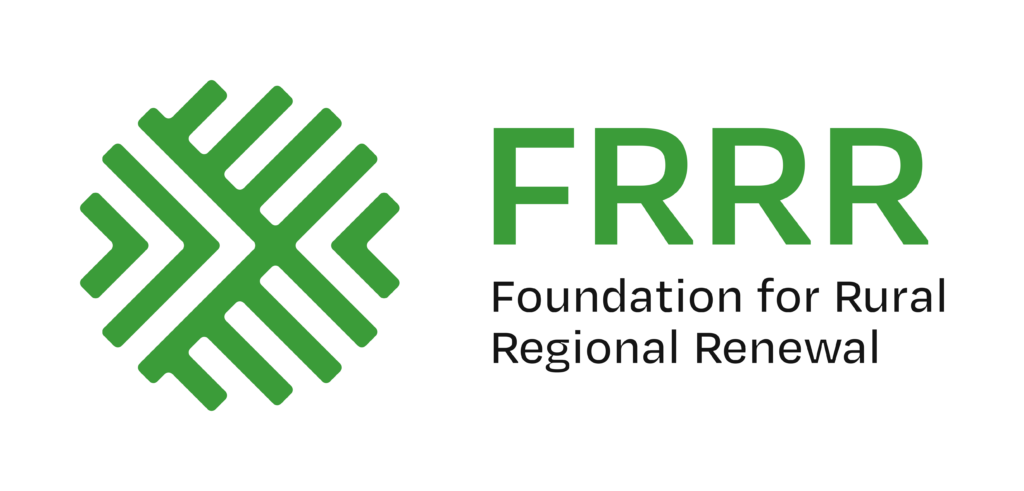
This week, FRRR unveiled a new brandmark and refreshed colour palette, the first since it was founded in 2000. The work was undertaken by renowned branding agency Houston.
FRRR’s CEO Natalie Egleton says the old brand had served the organisation well, but it was time to change.
“Our aim was to find a new look that reflects the modern, dynamic organisation that FRRR is – and indeed that remote, rural and regional Australia is – and which expresses the connection to rural Australia that is so central to how FRRR works. We think that our new symbol certainly does that. We hope that you come to love it as much as we do,” she said.
While everyone will see it differently, the logo represents:
- four connected forces for good – philanthropy, government, business and community – coming together to create something strong and sustainable, supportive;
- the big picture, taking a helicopter view but also getting to the fine grain, into the detail; and
- forward momentum and positivity, as indicated by the arrows.
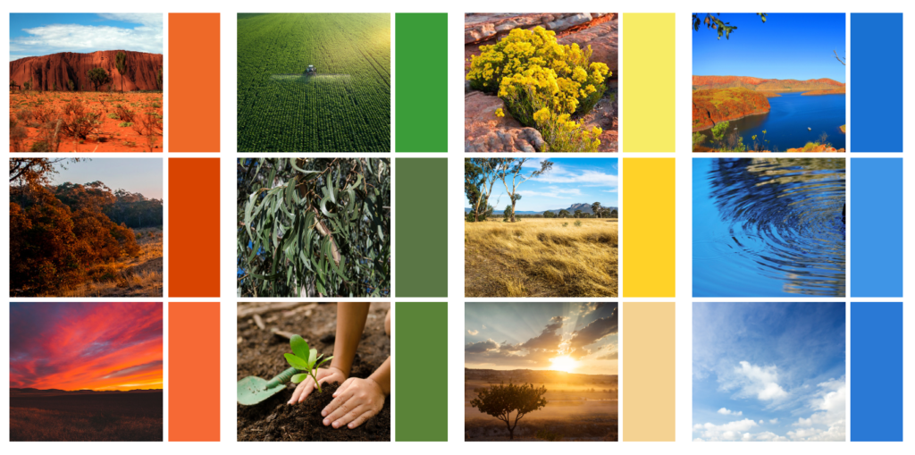
FRRR chose to make the primary colour green, for a sense of optimism, renewal and vibrancy, with secondary colours of burnt orange, yellow, sand and the blue of the sky, representing the diversity of remote, rural and regional Australia.